
Environmental Permitting Portal UI Refresh
Two simple UX changes turned a failing government portal into a usable service.
Timeline
April - December 2022
Team
1 UX Designer (me), 1 Business Analyst, 1 Product Manager, 1 Front-end Developer
My Role
User research · Workshop facilitation · UI design · Usability testing · Accessibility QA
The Problem
Ontario launched an online portal to replace paper applications for environmental permits.
Instead of improving efficiency, the platform created major usability barriers.
• 80% of submitted applications contained errors
• Customer service teams were overwhelmed with support calls
• Many users abandoned the portal and returned to paper submissions
Target Users
Ontarians who apply for or maintain provincial environmental permits:
• Individuals (e.g. sole proprietors, farmers)
• Corporations
• Consultants submitting applications on behalf of organizations
What the users struggled with
Collaborated with communication, IT and customer service teams, we conducted UX audit, user research and internal stakeholder consultations on the old platform (shown in the right).
We learned 3 major pain points:
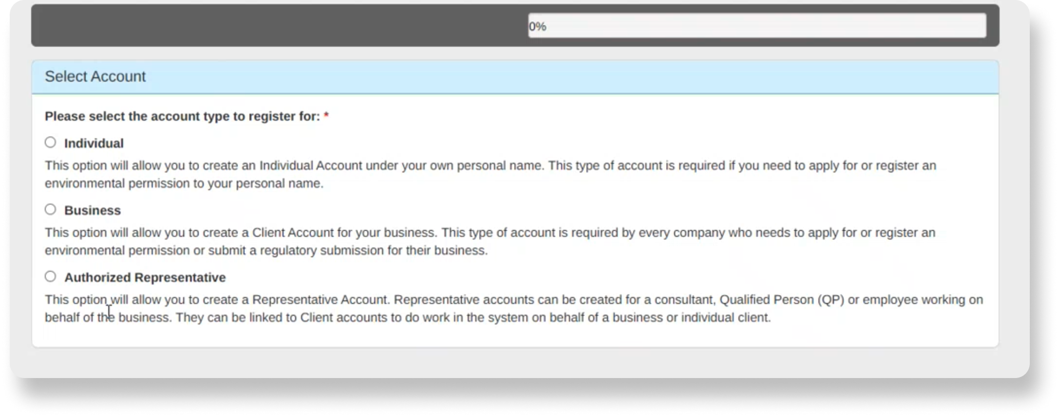
Confusing account set-up
Too many repetitive questions and redundant form fields
Confused about which type of account to register
The set-up process is cumbersome
“If you don’t need it, don’t ask for it”
Screenshots of UI from the old platform
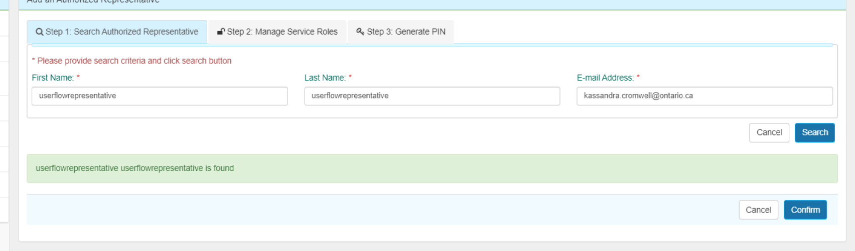
Back and forth with representatives
The process of assigning a representative is complicated
Delegation of a representative requires more effort than applying independently
“I’m afraid my clients get annoyed.”
Government jargon with no guidance
The language is difficult to understand.
The terminology is not intuitive.
Application form fields do not have enough help text or clear instructions.
“No help text is helpful. I always had to call.”
The 2 simple UX changes that made the biggest impact
Two small UX changes made a big difference in the portal, without a full UI redesign. Clearer steps and simpler words helped users get through the process more easily.
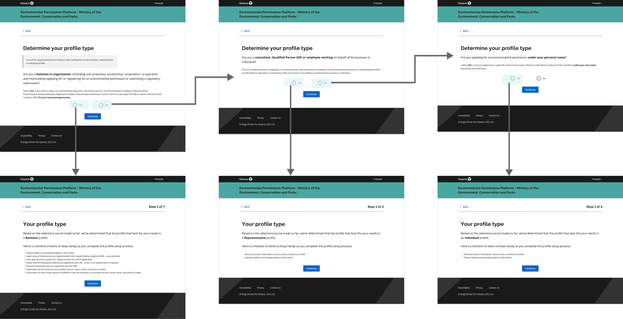
1. Simplified the application flow
Removed extra steps and duplicated buttons.
2. Used clearer wording
Changed confusing terms to plain language.
e.g. Before: “Delegated authority” → After: “Full access”
UX Changes:
Impacts:
Cut the representative assignment process from 13 steps and 3 emails down to 5 steps
Users reported that the plain-language terms were easier to understand
Application errors dropped from 80% to 20% after the update
Besides 2 simple changes, there’re more…
The two UX fixes above were quick wins. They helped right away, but they didn’t fully solve the problem.
To fix the root cause, we needed to step back and look at the whole experience. Working with the product manager, I proposed two bigger changes to the interface and user flow to make the process clearer and help prevent errors.
The new design also addressed major accessibility issues which you can find more details in the case study deck.

Implemented a conversational interface to help users determine which type of account to register
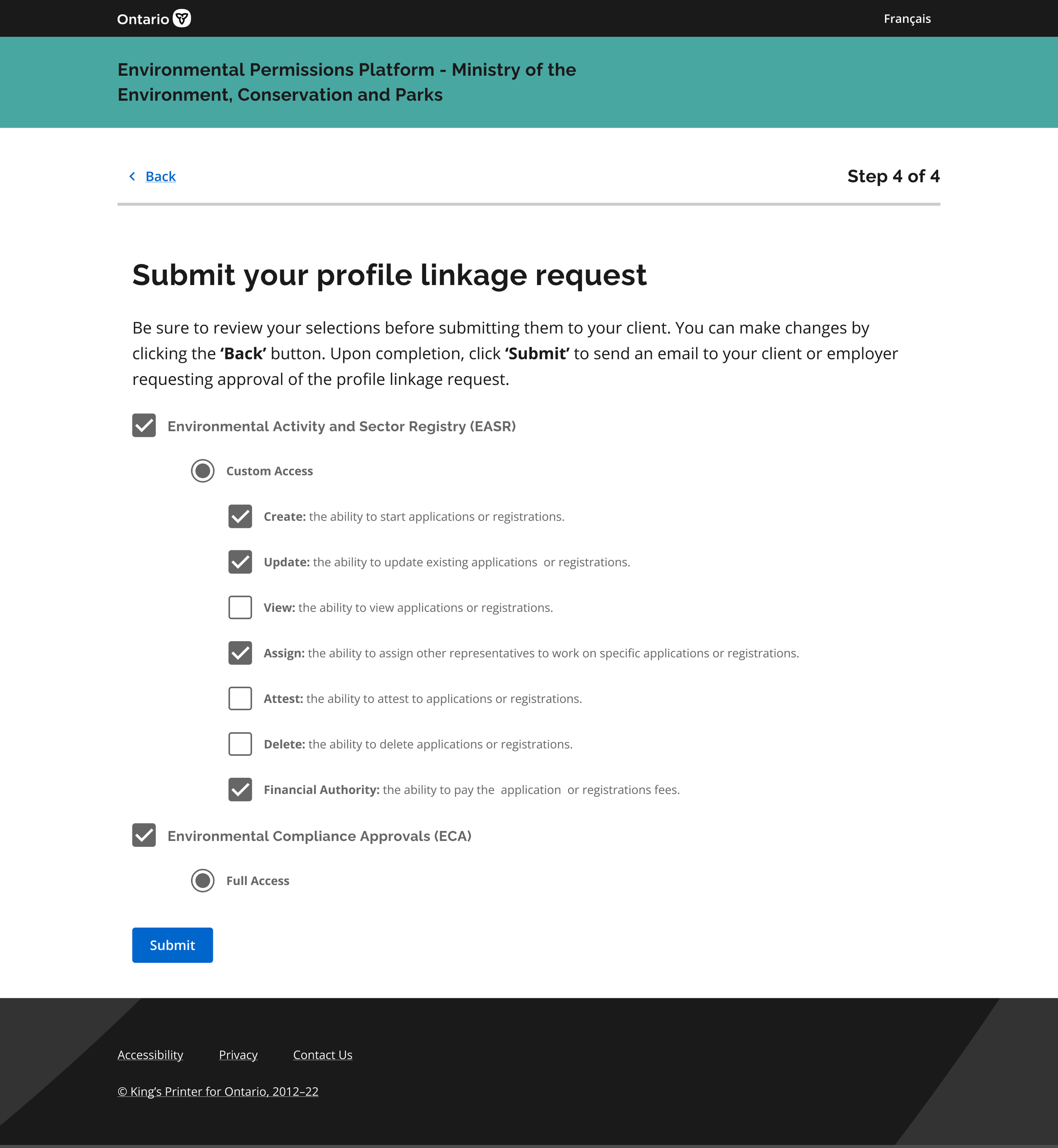
Representatives now request access themselves and choose their access level. Applicants only need one click to approve, instead of going back and forth.
The Process
1:
Discovery
The discovery phase is where we conducted both primary and secondary research to understand where the pain points lied and what was the root cause of the problem
2:
Design
After having understood the pain points better, we conducted ideation workshops with the stakeholders and started to design mock-ups to visualize the solutions.
3:
Validate
Then, in this phase, we presented the mock-ups with the internal teams to validate the technical and legal feasibility. Here we also conducted usability testing to test the user flows and UI.
The process was not ideally linear. I encountered 3 challenges:
Challenge 01: Resistance to plain language
Some stakeholders believed government interfaces must maintain a highly “official” tone and were hesitant to remove policy terminology.
Challenge 02: Policy constraints
Legal voiced the concern about certain fields (such as business number entry) could not display user-centric help text or hints due to federal and provincial policies designed to prevent fraud.
Challenge 03: Need for More Guided Ideation Frameworks
Early ideation workshops became spaces for stakeholders to vent frustrations rather than generate actionable design ideas. Non-experts were not familiar with the typical brainstorming structure of an ideation workshop
My approach to these challenges:
Listen First
I take time to understand stakeholder perspectives, constraints, and underlying needs before jumping into solutions.Data-Driven Decisions
I use research and data to prioritize work and support clear, objective design decisions.Work Within Constraints
I balance user needs with business and technical limitations to find practical, effective solutions.Guide the Process
I simplify design methods for non-designers by providing clear structure, improving workshops, and helping teams turn ideas into action.View the full case study to see my approach in action.
Final Design
Conversational Interface
Shift the burden of request from business owners to consultants
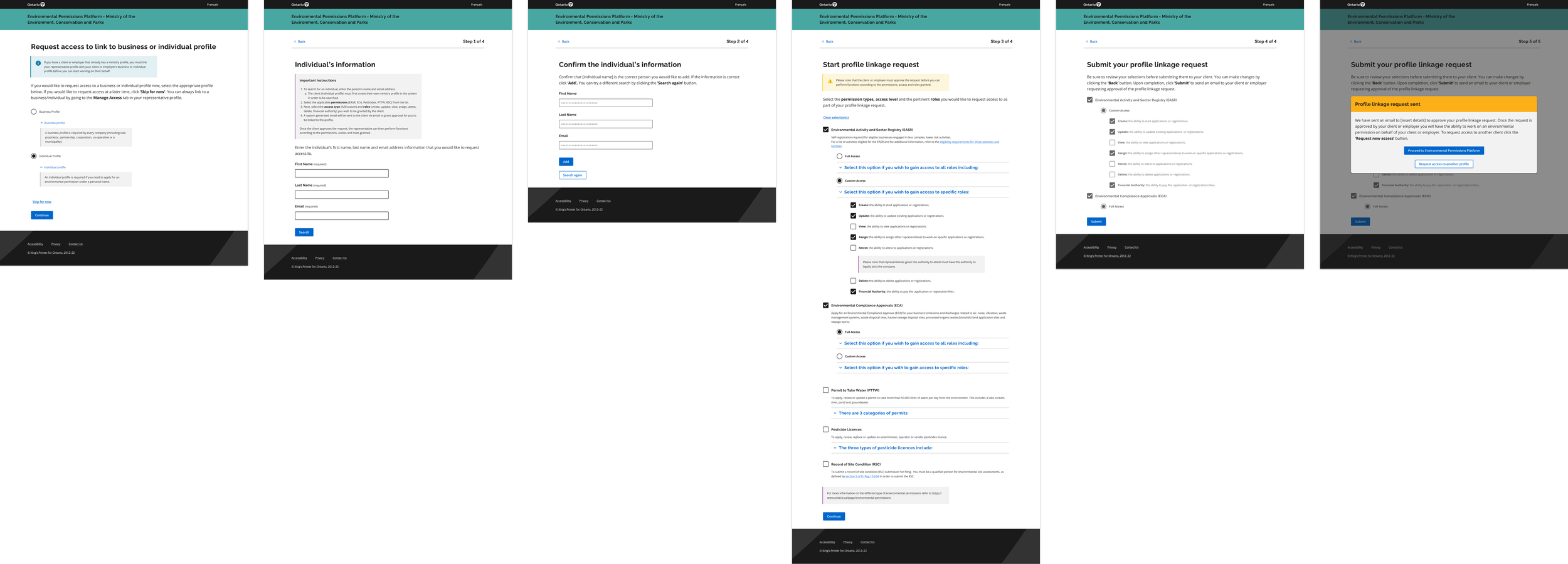
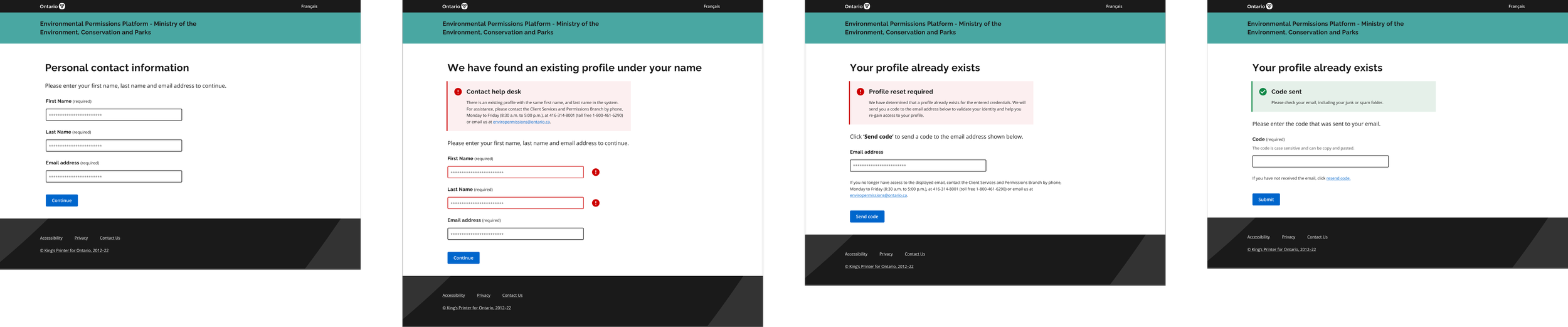
More user-friendly error messages
Learnings
Learned when to say “No” and learn when to make compromises
UX design process is NEVER LINEAR as we learned in the textbook; in reality, I need to consider many constraints and adjust the tools I’m using on the go
Sometimes small changes—like simpler flows and clearer wording—can make a huge difference. You don’t always need a full UI redesign to improve the user experience.
See the full story and more details in the prototype?
contact me at erxun.design@gmail.com